Mascot
| Development of the mascot
Major Southern California animation and film studios were contacted
by the LAOOC regarding the design of the mascot. Walt Disney Productions
was ultimately selected from among three finalists. Emphasis first focused
on developing something emblematic of the Southern California area, including
such possibilities as the sun, palm trees and seals. Considerations were
expanded to include the state of California, whose symbol is a bear, but
that idea was soon discarded since the Moscow Games had used a bear mascot.
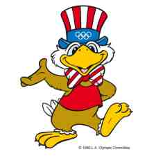
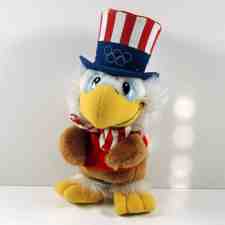
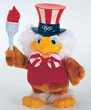
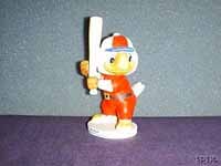
Finally, design development focused on symbols representative of
the entire United States and the logical choice was the eagle. Generally
considered a rather stern and aloof bird, a warmer, more friendly eagle
had to be created. A short, stubby, cuddly little eagle evolved. He had
a large head, bulbous middle section and a protruding derriere accented
by an array of tail feathers. Besides serving as the national bird of the
host country, the eagle was also universally recognized as an incarnation
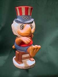
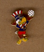
of the ideals cited in the Olympic motto: Since the eagle would have to be shown as a competitor in the various athletic events, the wings were drawn to function as “arms” and the feathers as “fingers.” The eagle was designed to work as a costumed character as well as a two-dimensional graphic symbol. The full-sized costume was successfully used for LAOOC promotional and youth activities. Moreover, Sam the Olympic Eagle proved commercially successful, as a doll and on mugs, pins, T-shirts and many other products. (Text from Official Report 1984, Vol. I, page 246) |
|
|
|
|
|
|