Pictograms
| Development of the sports pictograms
The review committee was given a presentation
which surveyed the entire design development process used by Bright and
Associates in creating the pictograms. Beginning with a critique
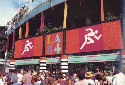
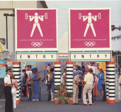
Pictogramms used on the exterior of the Coliseum are in Festive Federalism colors. In the development stage, Bright and Associates sought to create pictograms that would be used primarily for directional signing purposes, a critical factor in the Los Angeles area since the events would be held at a variety of locations. Therefore, it was essential that the pictograms communicate clearly and be highly visible. During the Games, the pictograms served primarily decorative purposes rather than as signing elements, but in 1980, no one anticipated that this would be the case. In creating the new pictograms, exploratory
sketches examined the use of partial figures, realistic figure images and
speed lines combined with the figures. It was concluded that partial figures
and realistic figures were difficult to decipher and movement associated
with the figures made them too busy and impaired legibility. A simple figure
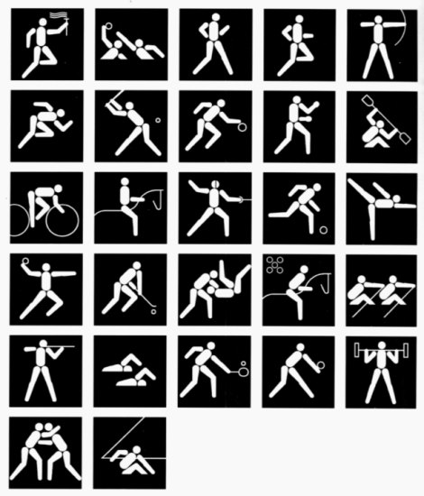
composed of 10 fundamental body parts worked well: a circle for the head,
an oval for the torso and eight simple parts representing the arms and
legs. This modular figure, when placed against a grid pattern, could be
recreated in any desired position, effectively portraying any Olympic event. 
These new pictograms met the specified criteria.
They were easily seen at a distance and clearly communicated their message
in a consistent manner using a system of modular forms and a common scale.
The system was also practical and flexible, allowing for a variety of positions
to be created with a minimal number of design modifications and permitting
reproduction in a positive or negative form, with or without a panel or
border. The design was distinctive, with the pure, geometric forms creating
an idealized human figure which was memorable in appearance and free of
stylistic fads. 
(Source document: Official
Report 1984, Vol. I, page 248) |
