The look of the 1968 Olympics
|
The look of the 1968 Olympics was described by Games designer Lance Wyman from New York:  Lance Wyman Photo: Jonathan Posnett "Graphic design became an important visual
ambassador for the 1968 Mexico Olympic Games, It was the first time the
games were hosted by a Latin American nation. In planning for the games,
Mexico, an emerging third world nation, could not afford to make the extensive
architectural statement made in Tokyo four years earlier. Graphic design
contributed to the ambiance of the Mexican games and helped to make a meaningful
visual impact for fewer pesos. 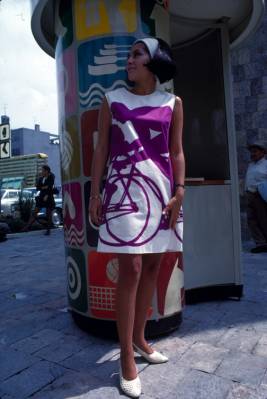
I first went to Mexico from New York in November, 1966 with British designer Peter Murdoch to participate in, and fortunately win, an international competition to design the graphics for the Games which would be held in October, 1968. The team that formulated the design program was headed by Pedro Ramirez Vázquez, Chairman of the Organizing Committee and an important Mexican architect. Along with his responsibilities for the entire Olympics. Vázquez took special interest in the design program, enabling rapid development of ideas, keeping everything on track and making sure things were implemented as designed. 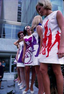
His team of design directors included: -
Eduardo Terrazas, for urban design; 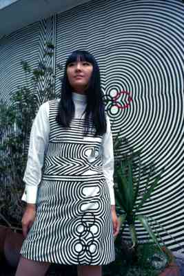
We were a multi-disciplined, multicultural team that worked efficiently together to design and direct the basic program." As I recall there were only two mandatory
requirements; that we use the official five ring Olympic symbol to identify
the games, and that we use three languages, Spanish, English and French,
for all written communication. The
Mexico 1968 logotype, based on traditional forms from the Mexican culture
as well as being Sixties Op-art kinetic typography, set the tone for the
entire graphics system. It was designed by integrating the official five
ring Olympic symbol into the number 68 to create a parallel ine typography
that suggested imagery found in Mexican preHispanic art and Mexican folk
art. The logotype powerfully expressed a sense of place and culture and
visually exclaimed the Games were in Mexico. 
Applications ranged from postage stamps to a two ton stadium entrance sculpture. An important kinetic application of the logotype was created by radiating its parallel lines outward, creating an image of Mexico as an emitting or expanding centre. The image was applied as painted wall murals throughout Mexico City, as a cast pattern on the Olympic torch, as film titles, as a postage stamp, as the fabric used for the uniforms of the Olympic guides, as helium filled balloons that identified the Olympic venues from the roadways and as large scale patterns of pure parallel lines painted directly on the plazas of the sport venues radiating outward from the pedestrian entrance portals. It became the Look of the Mexican Olympics. 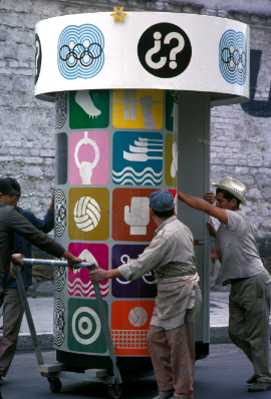
The parallel line typeface based on the letter
forms of the logotype was used for official inscriptions
on coins and medals, for titles in Olympic publications, and to identify
each of the sport venues by name on site signs and entry
tickets. Written messages in the parallel line typeface were easily
recognized as part of the Olympic program. In designing our icons we were
lucky to have the icon systems designed
four years earlier under the direction of Katzumi Masaru for the Tokyo
Olympics as a guiding light. 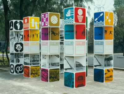
A major difference between Katzumi`s icons and ours is that the Tokyo sport icons were bold stick figures that incorporated the entire human figure. Our sport icons focused on an expressive detail, a part of the athlete`s body or a piece of equipment, creating images similar to glyphs found in Mexican preHispanic cultures. We relied heavily on the sport icons as communicators that could cross cultural and language barriers. 
Last, but by no meansleast, is colour. Colour
and Mexico are synonymous. We used bright colour to code the sport events,
the motor routes, the entry tickets, and the seating sections in the venues.
We applied colour liberally to postage stamps, publication mastheads, souvenirs,
and stadium plazas. Colour helped transform the 1968 Summer Olympic Games
into a Mexican fiesta." Source document: "The Olympic
Image", The first 100 Years, Compiled & Edited by Wei Yew |