Tickets
| Ticket Design
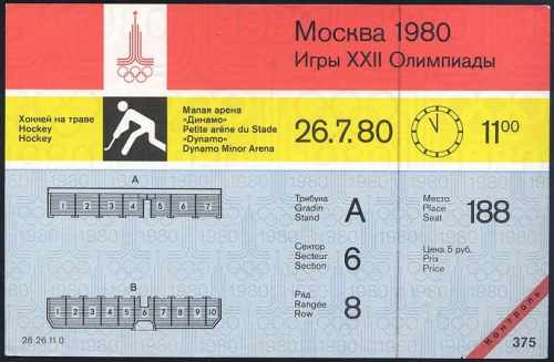
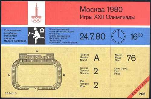
The OCOG-80 laid a great stress on outward appearance of Olympic admission tickets. An admission ticket should first of all inform its holder briefly but clearly about the sport, venue and time of competition, about the location of the seat on the stands. According to the designers a ticket was to have a distinct image by its shape, colours and graphic design thus becoming a kind of souvenir. Therefore, a somewhat unusual size was chosen measuring 110 by 170 mm. The front of each ticket was divided into three horizontal parts of different width. The upper part was red and remained the same for all the tickets bearing the official emblem of the Games of the XXII Olympiad and the words "Moscow 1980. Games of the XXII Olympiad" or "Tallinn 1980. Games of the XXII Olympiad" and so on. The middle part (different according to the day of the week) contained the name of sport in Russian, French and English, sport pictograph, name of venue also in three languages, the date and time of competition indicated also by a drawing of the clock face. The lower part had a background of protective
multiple design consisting of the official emblem of the Games and their
year made in one of six colours depending on location of the venue in Moscow.
On this part were a plan of the competition site indicating stands, sections,
and rows and its right margin displayed actual

The shift numbers on the tickets made for much easier control at the wickets when great masses of spectators were entering a venue. The reverse side was white. It had a map of venue location with regard to city streets and the nearest metro station. The traditional Note for Spectators was also printed there in three languages. There was the inscription "Moscow 80" in red at the upper right-hand corner. The most difficult job was making tables of seats indicating the stands, sections and rows. This job was made even more complicated by the fact that some Olympic facilities were still under construction or were being renovated in 1978. In spite of that, all the tables had been completed and handed over to printers by March 15, 1979. After that date, any alterations in the seating at the stands included into the tables were to be made only with approval of the Ticket Programme Department. 
The tickets to the Olympic Games have material value. Any counterfeiting even on a small scale may cause great organisational problems. Therefore, reliable precautions should be taken against any attempts at falsification. Several such protective measures had been taken both during the manufacture of paper and in the course of printing. The tickets were printed on special reinforced paper used for banknotes. Its technical qualities and characteristic rustle distinguish it instantly from other types of paper. Other protective elements were distinctly outlined watermarks in the shape of the official emblem of the Games and their year executed in several tints. The precautions also included coloured "security threads" used in banknotes, bearing microprinted Olympic rings alternating with the year of the Games. A two-colour multiple design was used for
the protective background of the front side. The colours were selected
with the least photographic colour discrimination. The above precautions
proved to be sufficient to completely eliminate the temptation to counterfeit
even single tickets. The whole set of tickets (6,070,717) took one year
to complete. The tickets were delivered to the OCOG-80 in late January
1980 and sorted out by code numbers. (Source document: Official Report 1980, Vol. 2, page 519) |
Numbers of visitors: 5.268.200